Lessons From My First Data Science Project
The first serious data science project I did was a class project to predict COVID mortality. We got a data set from Kaggle (originally sourced from the Mexican Ministry of Health) and, like every other team of junior data scientists, we proceeded to throw the whole kitchen sink and tried to see what stuck.
Step 1: Data Set and Cleaning
The data that we got had 1,048,574 samples and 21 features. The 21 features were:
- Patient sex (binary)
- Age (numeric)
- Pregnancy (binary)
- Covid test findings (categorical). A value of 1, 2, or 3 were positive results of varying severity, and 4 or greater were negative or inconclusive
- Hospitalized (binary)
- ICU hospitalization (binary)
- Date of death, or 9999-99-99 if the patient did not die (string)
As well as binary features about health history (pneumonia, smoking, cardiovascular disease, etc). Notably, some crucial features were missing: whether a patient had any previous infections, what their weight was (we did have a binary feature for obesity, but nothing else), what time the patients were admitted (which may be relevant as new covid variants emerge), etc. etc. The point is we were missing crucial predictive features.
Because we had no time series data, we just collapsed the date of death data down to a binary variable representing the patient either dying or not dying. There were also NaN variables we could easily account for (for example, all men had NaN for pregnancy data, and we could just set that to false).
We also made the choice to exclude all healthy people on the grounds that in practice our model would only be used on people who tested positive for covid. While it would be interesting to do a Bayesian analysis of how many people died who received a false negative and so on, we likely couldn’t do a robust analysis with the data we had (people who are discharged for a false negative result are not likely to have their covid deaths recorded) and it would require a prior about the prevalence of COVID among the population during an unknown and (in all likelihood) extremely volatile timeframe. For all these reasons, we dropped all rows with negative test results.
After determining what we were looking at, we broke the data down into several basic categories and did visualized it:
 Overall Demographics of Patients Who Tested Positive
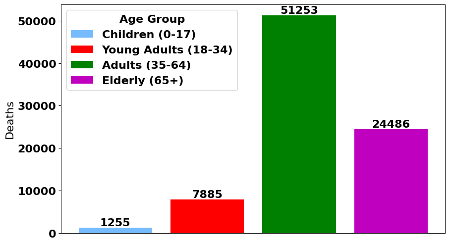
 Demographics of Deceased Patients
 More Demographics of Deceased Patients
 Demographics of Intubed Patients
Step 2: Exploratory Data Analysis
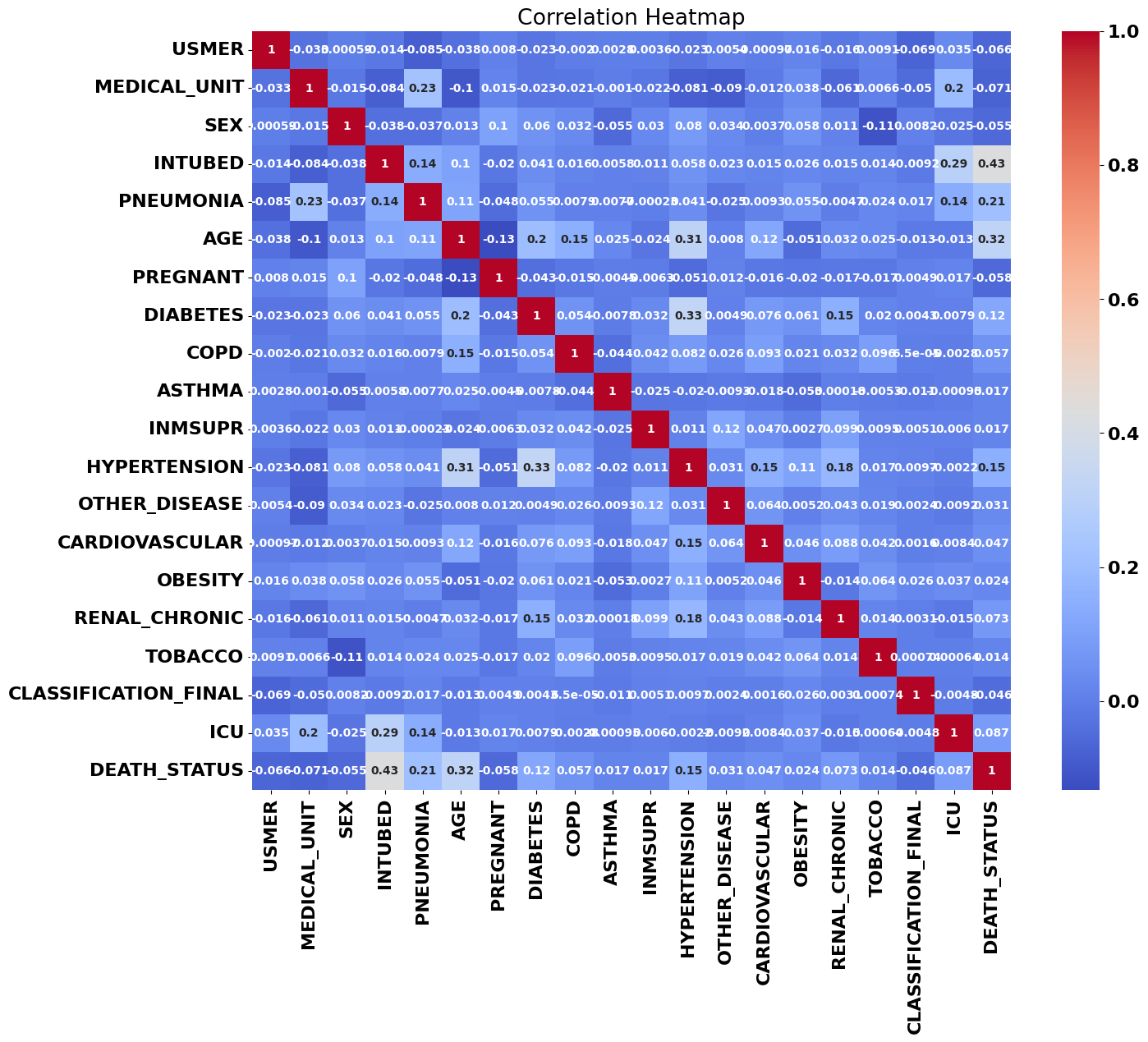
One of my first steps is usually to look at the data set’s correlation matrix; usually if there’s a high correlation between one of our features and the target variables, that’s a sign it’ll factor into any model we train.
The correlations that jumped out right away were patient age, pneumonia, and intubation, with intubation being not only the most strongly correlated variable with patient death, but the strongest correlation between any two variables. We can see a couple other correlations here: age and diabetes correlate with hypertension, for example, but those are only the most visible correlations: there are likely higher-dimensional relationships that humans can’t see with the naked eye.
Step 3: Solving a Small Problem
At some point while training these models, our accuracy was very high: over 90% accuracy. Unfortunately, because we were missing crucial features like weight and infection history, we knew something was wrong.
On closer inspection, it seemed like one of our features we introduced in our preliminary data analysis (and had retained during training) was a function of our target variable. That meant that our model was trained on data that wouldn’t be available when a patient was being treated. Essentially, we were suffering from look-ahead bias. We deleted that variable and our accuracy tumbled down to 70%, which was lower than we had hoped, but was still much better than a coin toss.
Step 4: Principal Component Analysis and Prediction
Our goal was also to create the most predictive model we could, and we were dealing with 20-dimensional input space with many binary variables. Naturally, we tried a principal component analysis to reduce our dimension, which gave astonishing accuracy with only two or three principal components:
 Model Accuracy by Number of PCAs
 Cumulative Explained Variation by Number of PCAs
Logistic regression, linear and quadratic discriminant analyses, k-nearest neighbors, and our random forest classifier all achieved maximum accuracy with only two principal components! When we look at the cumulative explained variance, we see that two principal components explains about 85% and three components explains nearly 100%. Having such high predictive power with only two or three principal components meant that there were only a tiny handful of factors that determined patient mortality.
What I wish we had done: I wish we had looked more closely at these principal components to figure out what each one actually represented. With only two or three principal components explaining basically the entire data set, it means they were likely to have an obvious interpretation: maybe they say something about the patient’s heart, lungs, or the severity of the infection.
What I wish we had done: I wish we had graphed patient mortality as a function of the first two principal components. We would likely have seen a linear surface whose slope very strongly correlated with patient deaths. This could have given us a spatial intuition for what our data looked like!
I did most of the data cleaning, and my teammates did a substantial portion of the data analysis. The one model I trained myself was the neural network, which at times was a bit fickle. Before we did principal component analysis, my neural networks suffered from vanishing gradients during training: all my loss values were NaN and I wasn’t able to get accuracy much better than a coin flip. After doing PCA, tweaking the steps per epoch, and changing the batch size, stochastic gradient descent behaved much better: I was able to recreate our accuracy of about 70%.
What I wish we had done: I wish I had tweaked my neural nets a bit more. They were trained with a ridiculous number of neurons per layer (three dense layers with 100 neurons!) when I had only 3 inputs. My neural nets also achieved maximum accuracy in only 3 epochs, which I take as another sign that I could have made a significantly smaller neural network. I think I could have achieved excellent accuracy with no more than 10 neurons per layer. I also wish I had experimented with different activation functions, and swapped SGD out for Adam.
Summary
We got an A on our project, and were reasonably happy with how our work turned out. I’m kind of happy our data set was a bit messy and needed to be cleaned so much, and I’m happy we spent so much time breaking down the data set. It made it clear how skewed it was towards some demographics (we had a lot of smokers and obese patients) and away from others (we had very few children). I don’t think an accuracy of 70% is deployable to a hospital with real patients, but some analysis of correlation and PCAs would indicate what features would predict patient mortality most accurately. Our most accurate model was the random forest classifier, although our models had such similar accuracy that any one would probably have been acceptable.
